Project: Glasshouse at Chelsea Flower Show
Author: Sarah Buxton, Essential Ambience
Essential Ambience is delighted to have been asked to design the interior of the TEGH Orangery at this year’s Chelsea Flower Show. We have really enjoyed creating a ‘real’ interior and that visitors will, we hope, remember long after the show has closed.
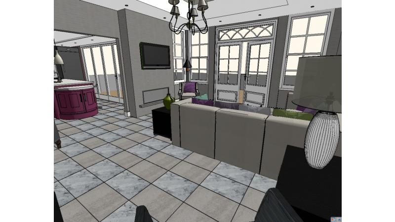
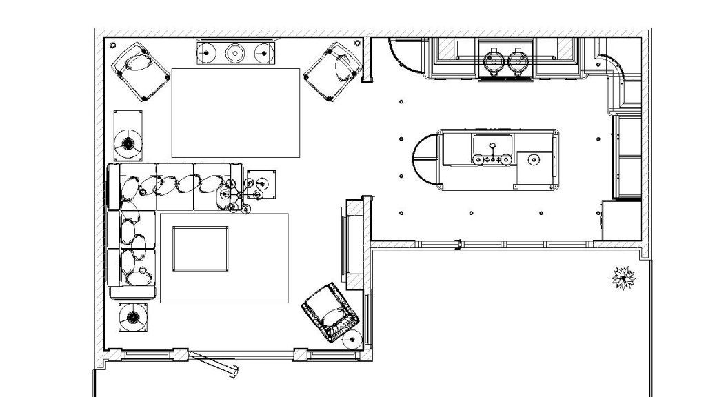
Every home needs focal points to create interest and to invite you from one space to another.
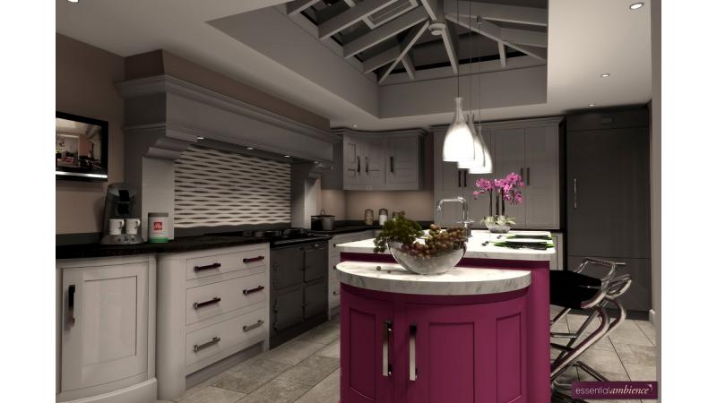
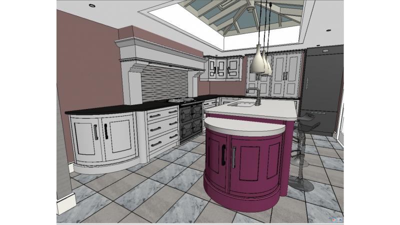
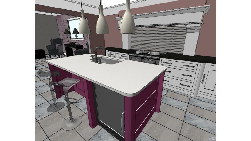
In the kitchen we have used a strong pink colour on the island unit; a bold colour that immediately welcomes you. Who could resist a colour called ‘Mischief’! The white Carrera marble worktop on the island makes a striking contrast against the gleaming dark grey finish of the Aga with its iconic chrome lids.
We have created a bespoke splash back to the AGA by using some beautiful wallpaper behind glass. The wallpaper has been chosen for its quiet, contemporary style, and the silver foil in the design picks up the chrome of the AGA.
The beautiful workmanship of the kitchen joinery is painted a sophisticated French Grey, chosen to compliment the toffee coloured striations of the Black Forest stone work tops on the remaining units.
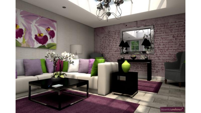
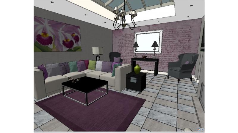
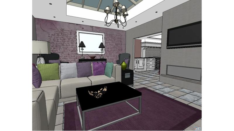
As you look from the kitchen into the lounge there is a large canvas print of a moth orchid, taken from the RHS archive of botanical art, and which we felt was most appropriate. The orchid was the inspiration for the colour scheme. With so many beautiful flowers of every imaginably colour and hue on display at the show we didn’t want the orangery to look drab! We had fun choosing some beautiful fabrics, in lovely colours and with different textures to catch the light.
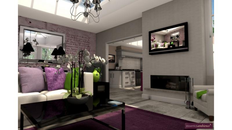
Having created a strong feature on one wall, we needed to make a bit of a splash on the end wall. The view from the French doors had to be just as interesting as the view from the kitchen. Some classy Graphiti seemed a good idea. A beautiful old document called 'Henry…..? taken from the National Maritime Museum was just what we were looking for. We customised it a little to work with our colour scheme and had it produced to fit the whole wall!
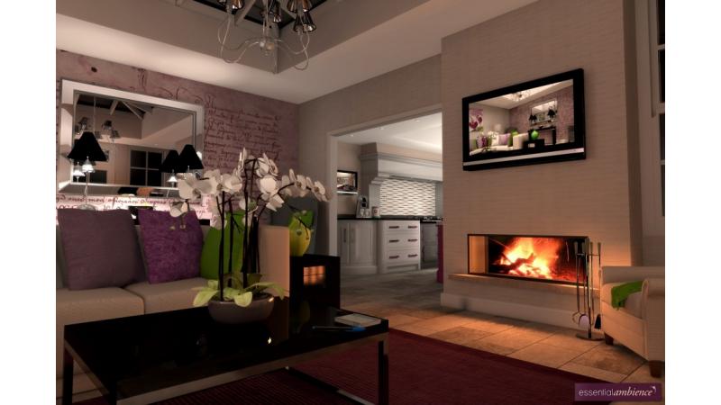
Every home should have mirrors to give an increased sense of space and reflect light. The mirror we chose has a large chaffered, mirrored frame. It’s glamorous style sits well against the mural, and reflects the view of orangery.
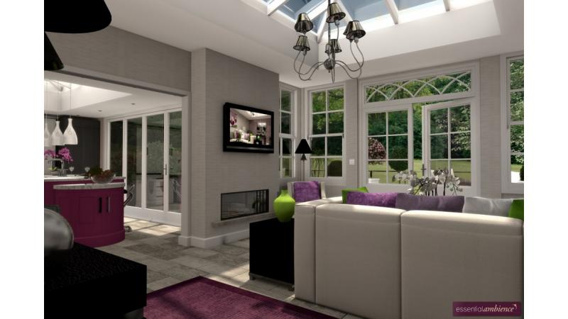
In most homes, spaces quite often have to be multi-functional. The desk provides a quiet place to study in a space that is flooded with light.
The large 'Heath' chairs are real statement pieces, and frame the desk and the mirror at the end the lounge.
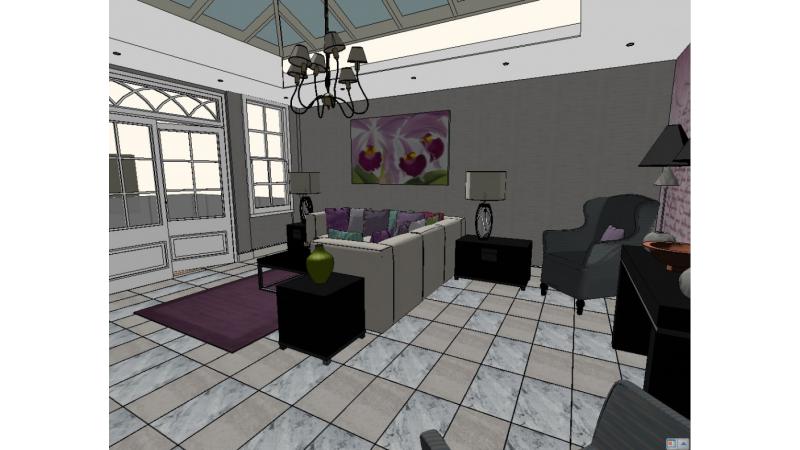
Rugs are a great way to add colour and texture to your environment. They can also help to add softness to the acoustic of a room. The simply designed rugs we chose, are in a rich plummy colour to compliment the pink of the orchid print and the bold tones of the kitchen island unit.
The beautiful grey floor tiles with the flecks of cream determined our choice of cream upholstery fabric, and the silvery tones of the wall covering.
Repeating themes and colours helps to achieve harmonious interiors. We selected the same design of wall covering, but in a different colour way, that we’ve used for the splash back in the kitchen. It adds a contemporary style and texture, but is a gently colour that provides interest without fighting the other elements in the room.
The lighting has been carefully designed to enhance the Orangery and bring it to life at night. We have used a mix of LED downlights, pendants, and table lamps to provide layers of lighting to allow different lighting moods to be created.
We hope you will enjoy the orangery interior as muc