Professional articles | Blog | ARCHLine.XP
Finalising the design work: visuals and rendering
Blog written by ARCHLine.XP user interior designer Flora Orosz from Siroco Interiors Ltd.
Our post today is about the favorite part of an interior designer’s job, when as a result of many days, weeks and months of consultation and design work, the project is finished and the masterpiece is born. The client receives the final visuals, approves them, the contractor gets the construction plans, and the moment when the piece is ready, habitable, livable and tangible. Unfortunately, we seldom have a chance to take a picture of the result, but it is possible now and thus we can show the entire process of creating the kitchen.
We have already shown the first phase of the design work, the modeling, in our post of ”New Feature of ARCHLine.XP: Kitchen design made simple” so it is time to move on.
The visuals
The realistic 3D visual design work called rendering can be done particularly beautifully and quickly in the 2014 version of ARCHLine.XP and in the 2015 version it is expected to be even better. What is happening during this time?
The software in the setup model, given lighting conditions and material types and by tracing the light rays, calculates how light is bouncing on and off the objects and where surfaces will be in shadow or illuminated. The precision of light ray tracing can be adjusted, the higher the precision is the nicer the result and the longer the rendering.
How will be the result realistic?
This depends on three things - there are some minor tricks too that will be discussed later. Let’s start at the beginning:
This is the stage we are at now with our kitchen, the model is ready, the client approved the layout and we do not change it any more.

Let us start with the first important task:
1, Settings of the rendering panel
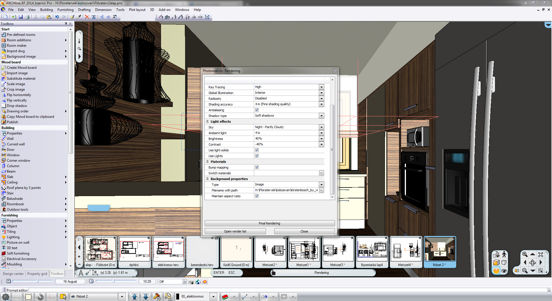
I always prefer to keep Ray Tracing as mentioned above high because this is how surfaces will become finely tinctured.
Keep Global Illumination as Interior since we are working inside. Antialiasing blurs borderlines slightly making the result even more realistic, just like soft-shadows. Of course, there are cases when sharp lights/shadows are needed and we should adjust accordingly.
It is worth to play around with ambient light settings. What worked for me was that I let in only minimal external light and most of the lighting was given by internal lamps.
Putting a real natural photo in the background helps a lot to make it look more realistic, this is a simple but very effective trick we can use.
A few minutes after starting rendering we get the result below:

This result is not too bad I think but it is too sterile, lights are a little too sharp and also lifeless since we have external lighting coming in only.
It is time to setup our own lighting.
2. Settings of lighting
Of the software’s own lamp collection I chose a work place spot-light and placed it below the upper cupboard. This lamp type has its own light source assigned to it already, which is a linear type neon light source, making our life easier.
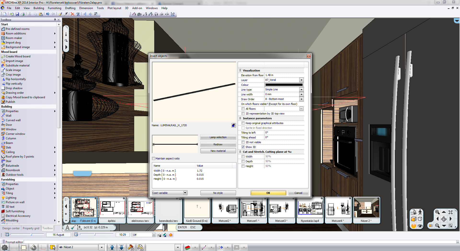
What if we want to assign light source to a downloaded lamp type?

Unfortunately, on request from the client, we have to get rid of the planned KARE lamp and put in the design a Tom Dixon lamp instead.
What has also changed (again, on request from the client) was the veneer on the furniture but we will come back to this later.
lamp removed …

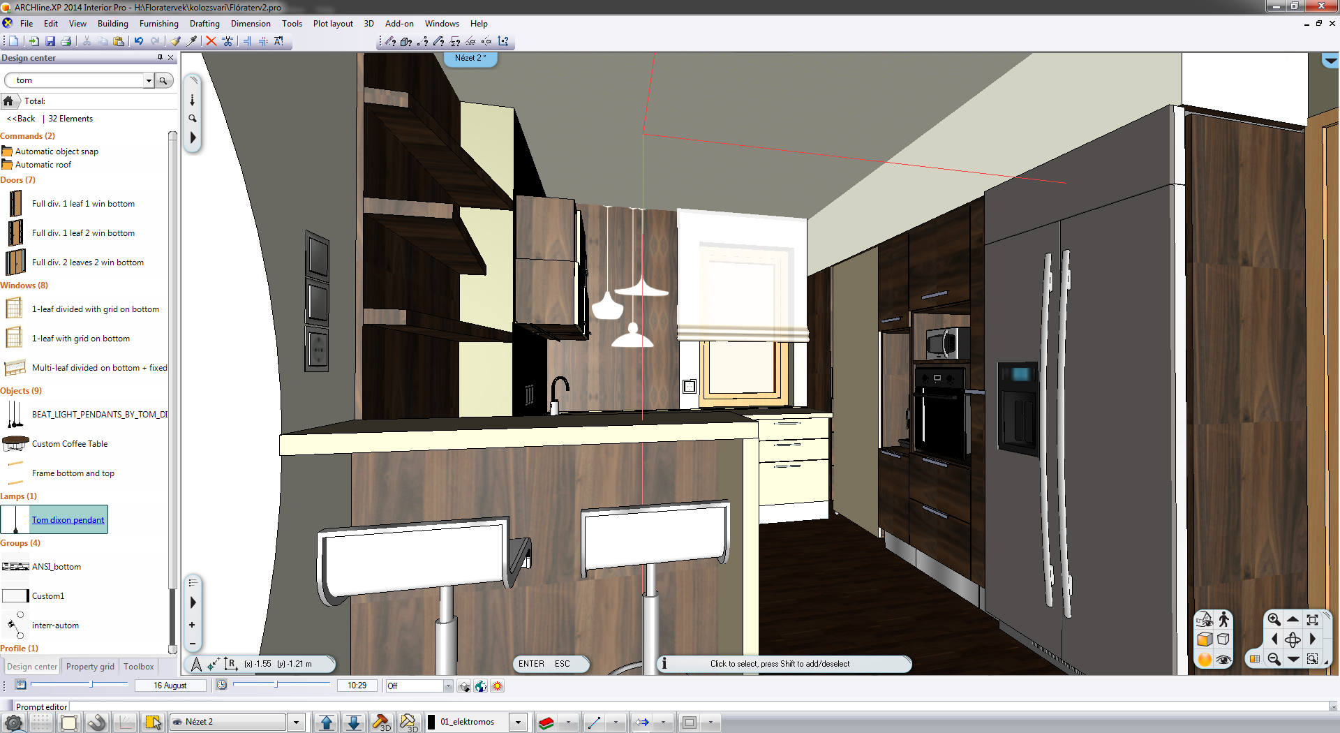
… and the new lamp dragged and dropped in the design.
Now comes the gist of it, assigning light to an object. This can be done with any object but, of course, the most usual it is to a lamp.
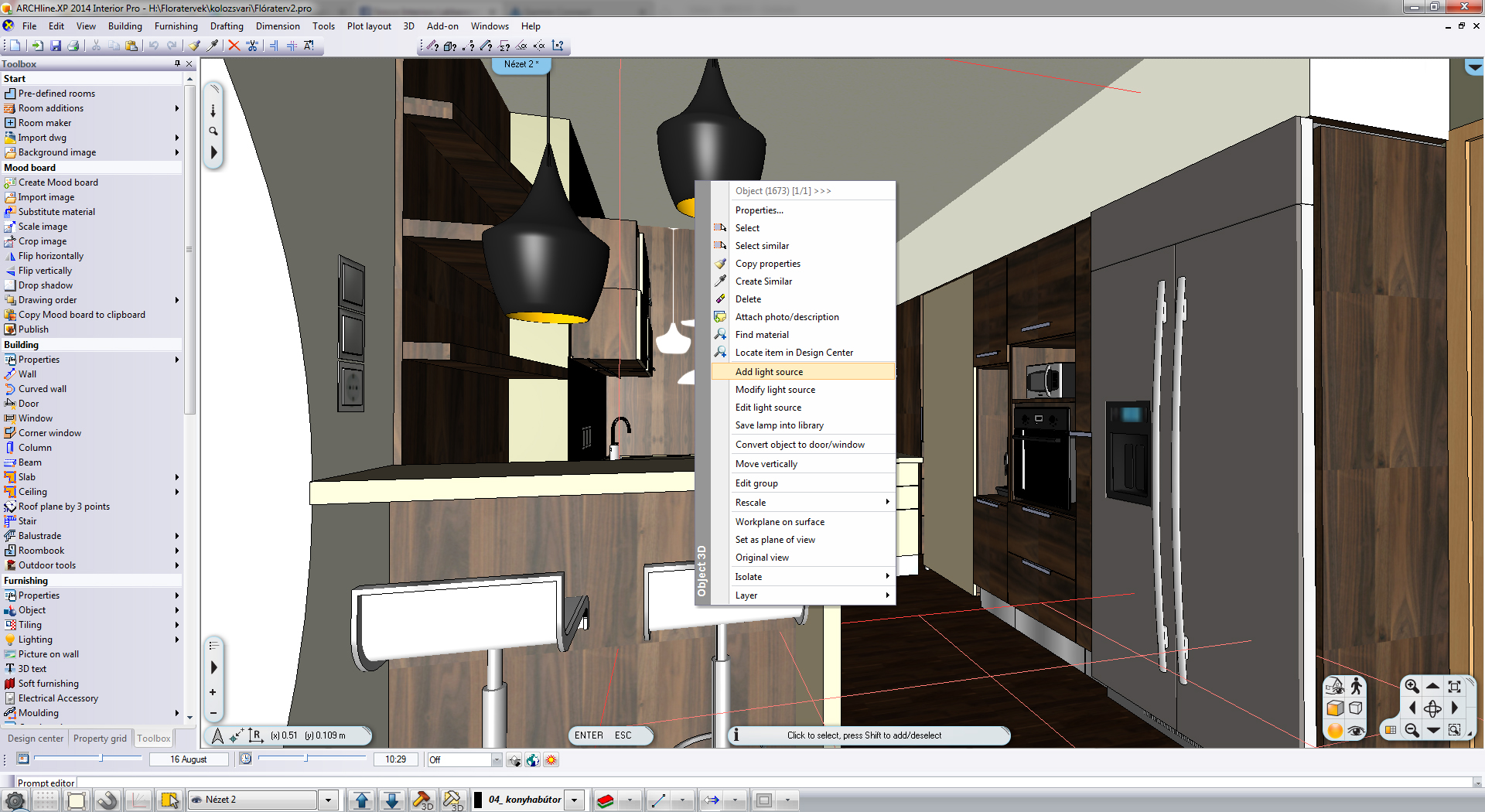
After assigning we have to choose the type of the light source:

When this is done too, by clicking on the object, a yellow light bulb icon comes up with which we can set the position of the light source compared to that of the object.
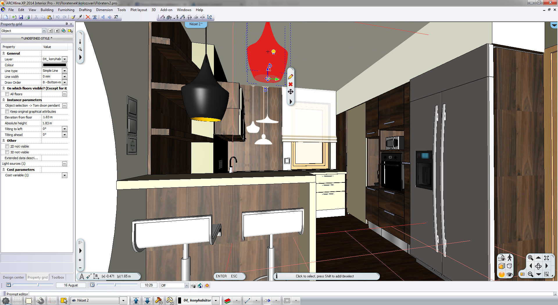
I set it up so that it should be on the same place as that of the real light bulb. After rendering we get a quite nice result.
Ami még nagyon nem tetszik, az a hűtő felülete.

Now comes the third important rendering factor.
3. Material types
We spoke several times about materials already but their greatest significance comes about in these photo realistic pictures since it is not at all irrelevant what the surfaces are (apropos, do not forget to turn on the “bump mapping” option when rendering) and how light is reflected off them. What I still do not like is the surface of the fridge. The metal surface of the fridge should show much more reflection so after some experimentation I gave it a basic grey chrome material type. And there it is:

As we know the devil is in the details, changing materials the quality can be improved further, but it is acceptable for now.
Conclusion:
The client was very happy with the result so finally we got the construction started.

Well, hard to believe but of that above we got that below:


I think it is wonderful, don’t you???