NEW SOLUTIONS TO WORK IN BIM
Some click and ARCHLine.XP displays the project exactly as you want in floor plan, print layouts, elevation and section views. Collaborate better with co-designers using certified IFC, RFA, DWG, SKP import/export.
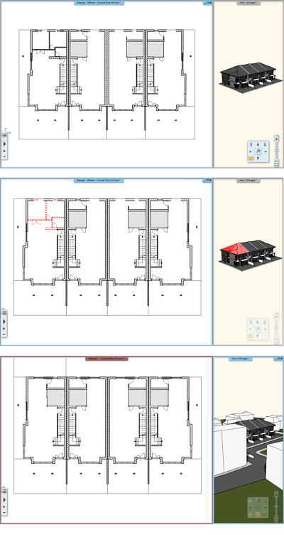
Design Phases
Using design phases you can separate the building construction into multi-phase design.
Building renovation projects, or the project complexity often requires to separate in multiple phases.
Design phase filters:
The Design phase filters are rules, which help you to identify the status of the building elements, such as New, Existing, To be demolished. ARCHLine.XP 2019 has 5 such filters:
1. All phases
2. Existing
3. Demolishing plans
4. Existing after demolish
5. New construction plan
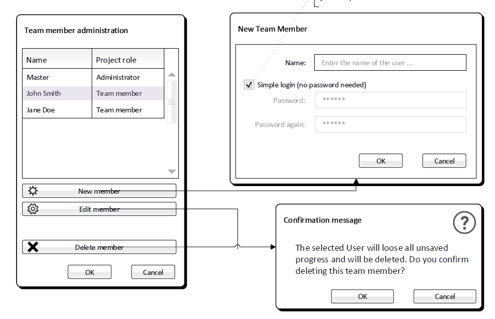
Renewed Multi-user (teamwork) project
Every part of your project updates automatically, so that the plan and the documentation are one coherent unit through the lifecycle of it.
Rules of the game:
- Teamwork allows simultaneous access to a shared model through use of a central model.
- The central model has to be saved on a network drive to which all team members have access.
- Master working area is privileged to define team project fundamentals (Storey structure, layers, geo-location and initial state of the project)
- All users work locally on different working areas. Every user can manage one working area in active state to which new elements are added.
- Graphic Override enabled to provide different output of the view (color, line types, line weight, half-tone, and hatch pattern).
- Save command means synchronizing local working areas with central model so that other users can see the updated work
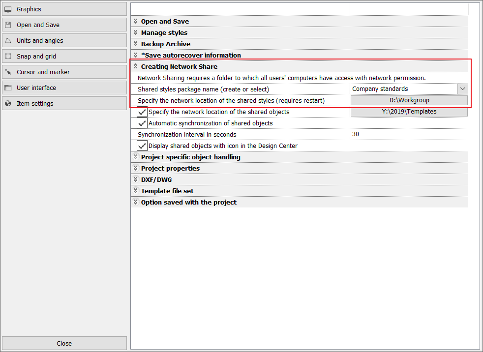
Deploying Standard Styles through an Organization
You can create and deploy styles within your organization if you define the organizational style package with name and shared network location (Path).
Styles relocated to company package are accessible to all users on shared network.
Implementing organizational standards and rules allow users to become more proficient.
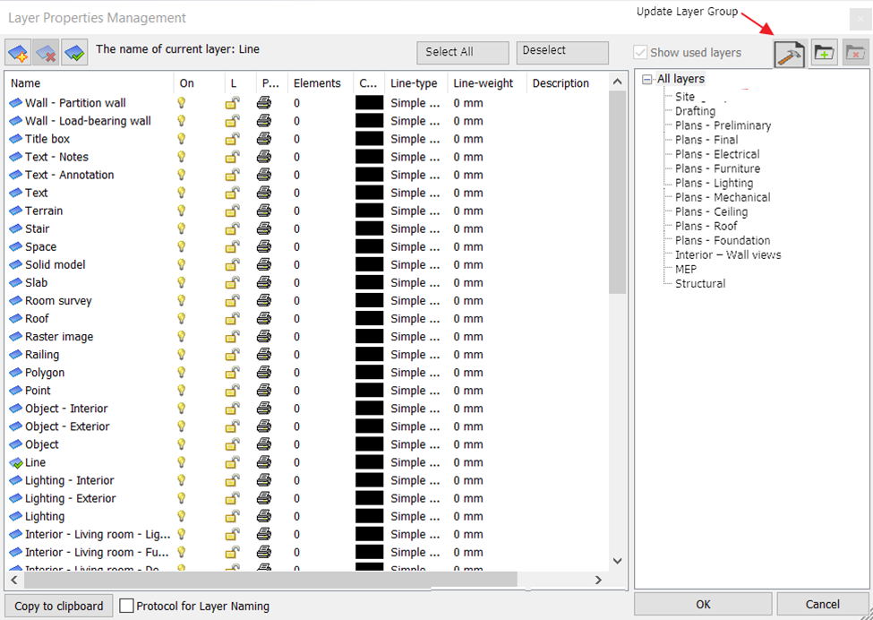
Layer visibility groups
Layer visibility groups is a new feature for better organizing project data, to easily switch on/off the layers, which belong together in a certain perspective.
This will help to handle the layers holding scanned images, imported rawings, equipment, machinery as units, rather than separate entities.
Switching between visibility groups you can hide or show the desired part of the project in one step, making the handling of project content much more efficient.
Multiple instances of ARCHLine.XP
You might need some parts of a project to be used in another project. As ARCHLine.XP 2019 can be run in more instances, several projects can be opened at once, and all of them can be edited as well, meaning you can, for instance, copy elements from project A into project B.
Simply use the Copy command to pick up a detail, and Paste it into another instance of ARCHLine.XP.

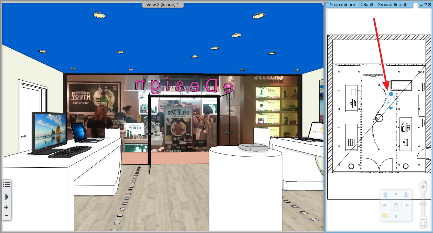
View Control Bar
The View Control Bar provides quick access to rules to control the display of elements in different views.
The View Control Bar includes the following tools:
- Phase status
- Phase filters
- Wall state
- Opening Detail Level
- Layer visibility groups
- Input line
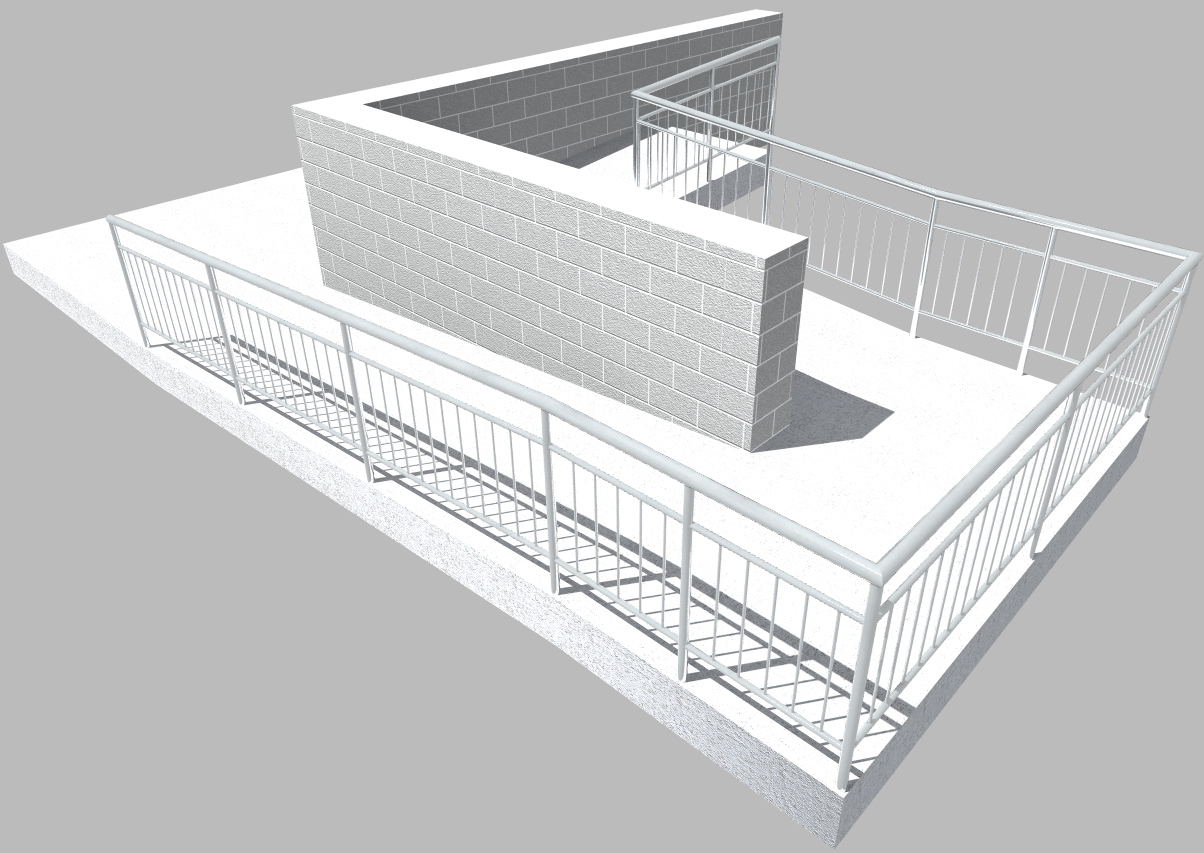
Renewed ramp tools
With the revamped ramp tool, creating a ramp is as easy as creating a staircase.
3 new ramp creating tools are available:
- Straight sloped ramp
- Arched ramp
- Two ramp segments connected by a landing
The boundaries of the created ramps can be adjusted via the standard 2D drawing tools at will.
The cross section profile of the ramp can be also freely adjusted.
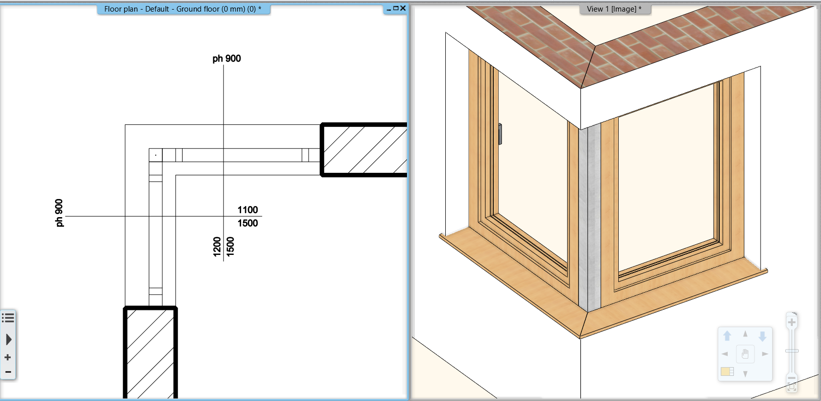
Join two windows as corner window
Any combination of standard windows can be joined up to form a corner window. There are two methods to create such a corner window:
- Automatic - the program creates the joint between the windows automatically, and adds the mulion as well.
- Manual - after moving the windows to the corner, the "Trim/extend wall recess" command will allow to modify the hole on the left or right side of the windows.
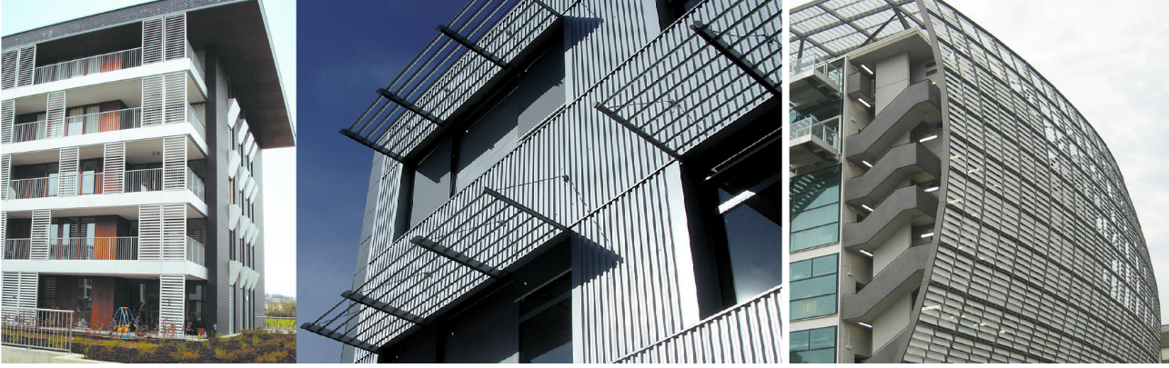
Brise Soleil
The modern building structures require brise soleil objects.
This tool is renewed greatly. The Brise Soleils are ready to be used as 3 separate tools in ARCHLine.XP.
-Horizontal
-Vertical
-Custom shapes
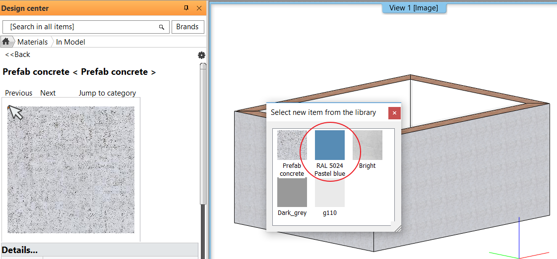
Colour Cards
The Colour Card is for replacing a colour or texture with another colour or texture you choose - but this time, the change will take place on the entire 3D model. It replaces the used colour or texture with one of the predefined group of elements.
With only one click, you can visualize how the building would look like in an entirely different colour scheme. You can either create a new Colour Card, or turn an existing material into a new Card.
In the Design Center, select the Material panel and In Model category
Click on a material you are going to convert. Click on Options button and select the command: Convert to Colour Card Group.
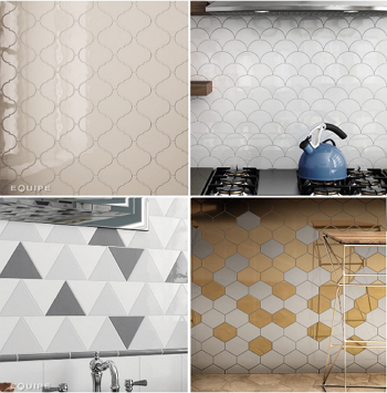
Tiling with predefined patterns
The number of Built-In pattern has been increased, as modern tiling layouts require more variation. With more patterns, and the ability to use colour variations, you are ready to go to create amazing layouts.
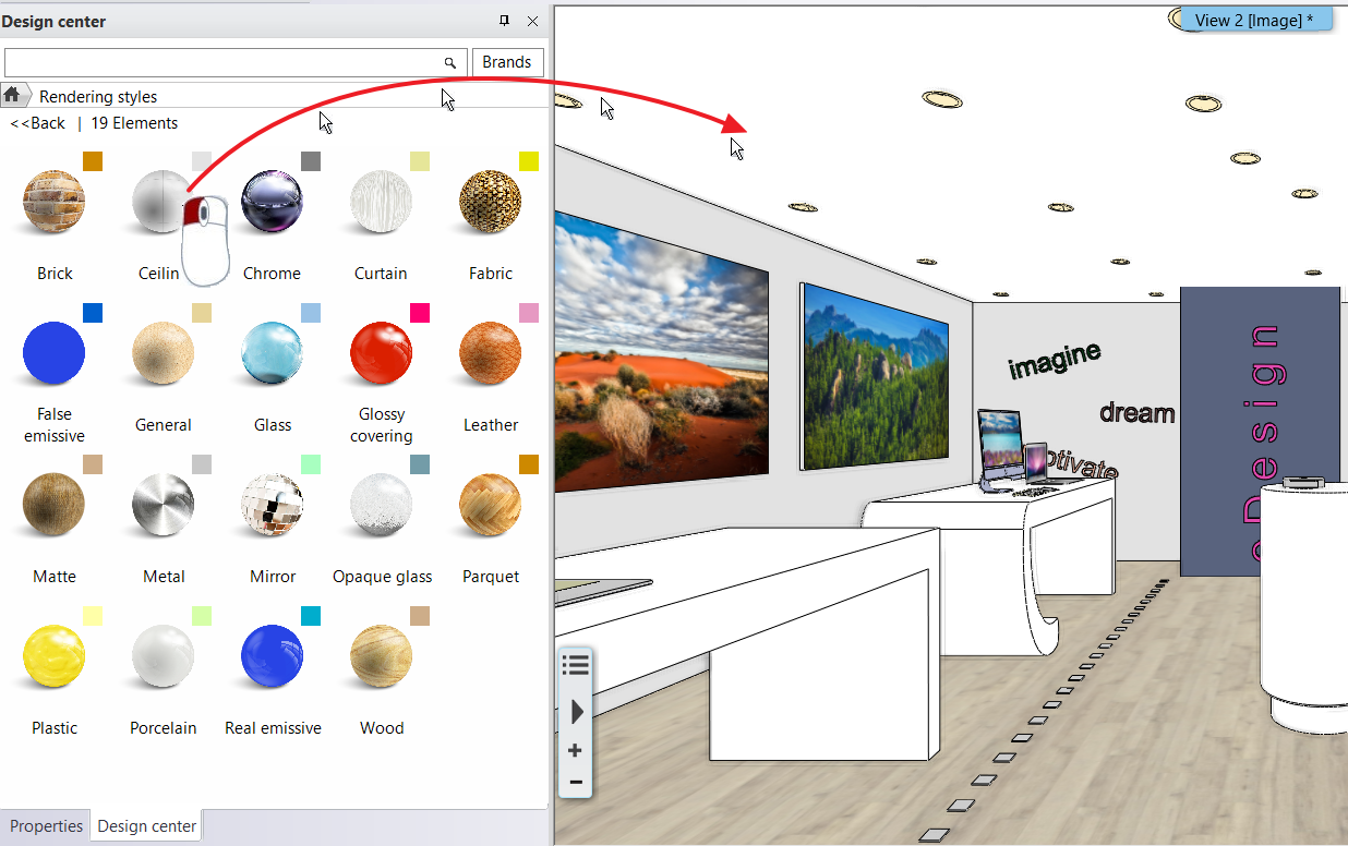
Rendering Styles
In order to yield photorealistic renders, you need to set up the materials correctly.
The Render quality and performance parameters are classified into specific groups such as metal, glass, brick, mirror, etc. These render styles can be assigned with drag and drop to any material. The result can be assessed in the integrated render window.
The command does NOT change the size and texture of the materials, it replaces the material quality parameters only.
In addition to the sets, custom settings can be made, but the use of custom properties is primarily recommended for users with rendering experience.
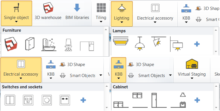
Ribbon bar menu access to most common object types
For elements such as objects, lamps, switches and sockets or even cabinets, clicking on the icons the program displays in the Design Centre the selected category. You can place the content of the category with "drag and drop" method.
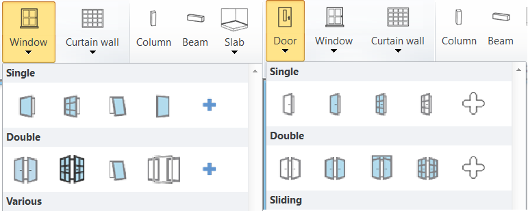
Ribbon bar menu access to most common door / window types
For elements such as doors and windows clicking on type icons you can place the most common door / window types directly onto your model.
In addition, clicking on the + icon the program displays the selected category in the Design Center. You can place the content of the category with the "drag and drop" method.
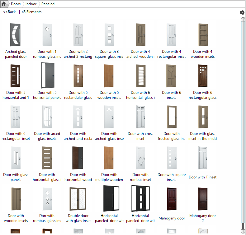
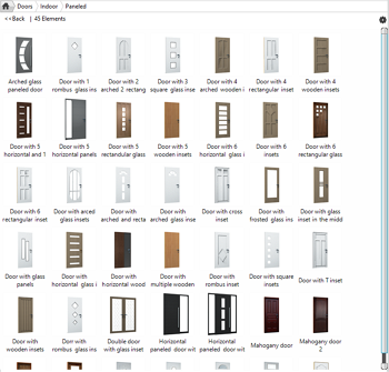
New Paneled Doors
The Paneled doors category is extended with 43 new typical paneled doors.
Using these makes the design even faster, as you'll be choosing from pre-designed elements.
The doors are parametric, textures can be changed, so they can fit the desired outcome nicely.
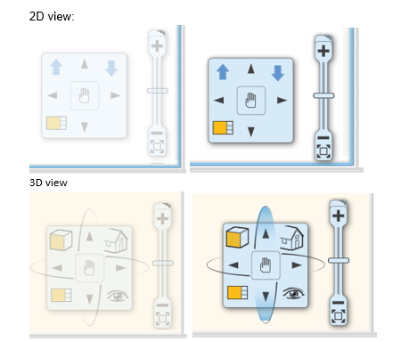
Renewed Navibar tool
The navigation controls are in the bottom right corner of the view and fade out when you are not using them. To show the navigation controls, move the mouse over the controls.
The NaviBar is equipped with a series of new features - navigate between floors, fit your model to screen, and orbit at will.
Camera icon on Floor Plan view
Camera icon allows to view what we would actually see if we were standing at the given location in the floorplan.
This is a simple and efficient way to control your perspective views.
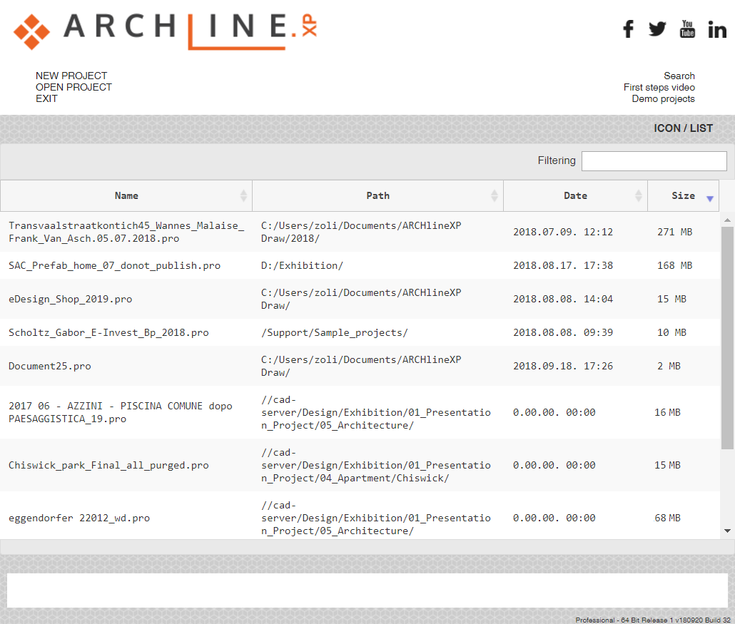
Welcome Screen – Icon / List view
We are expanding the welcome dialog with a simple list view where all projects are listed with following details:
Project name | Path | Date and Size form.
This would allow you to display up to hundreds of projects at once, sorted by name, date, etc.
You can swap the ICON / LIST view to the right side of the dialog.
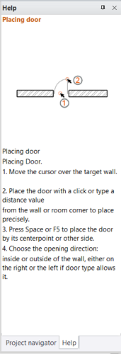
Help panel
On the right side of the screen, the Help panel appears together with Project Navigator by default.
The Help panel shortly introduces how to use the currently selected tool. It will show an image (optional) and the steps for using the tool and the special options (if any) related to the tool.
If you want to create more space in the drawing area, you can hide this panel, click the Auto Hide icon in the upper right corner and the panel disappears behind a tab. To see the panel again, hover over the tab, and you see the panels in a slimmed-down format. To close the panel completely, click the X in the upper right corner. To see the tray and its panels again, select Option > User Interface - Help.
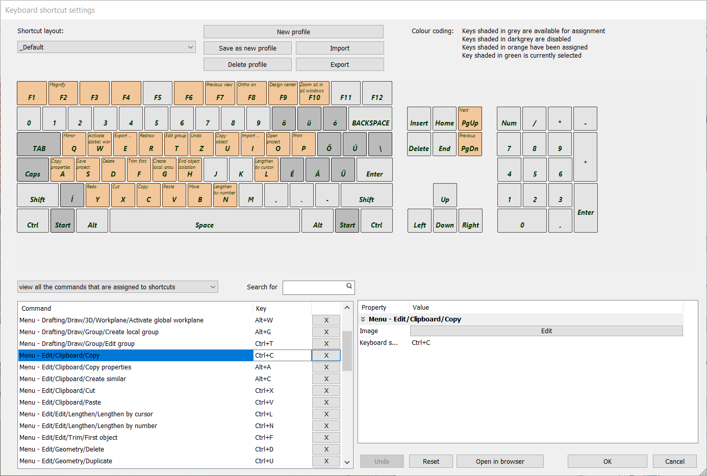
Visual keyboard layout for keyboard shortcuts
Keyboard shortcuts provide an alternative way to execute commands.
The new ARCHLine.XP 2019 keyboard shortcut management can boost your productivity.
Save commands to your keyboard, visualize the saved combinations, and build up customized user profiles.
Decals on walls: Managing transparent images
Transparent PNG images can be used to fit any shape without a rectangle frame. This means that you can place such PNG images as wall decals.
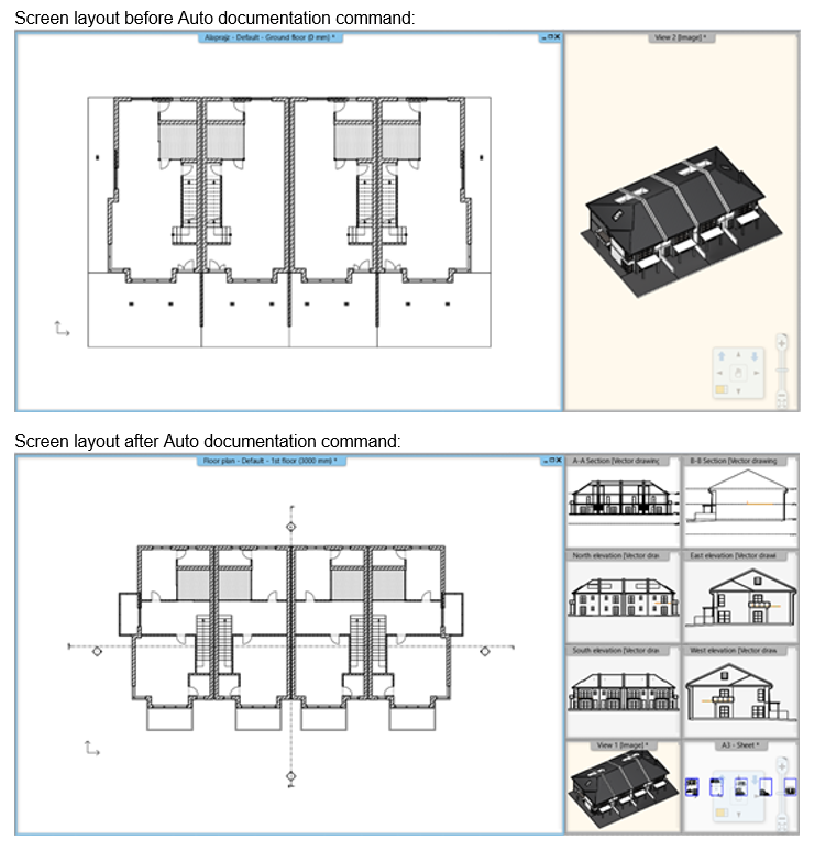
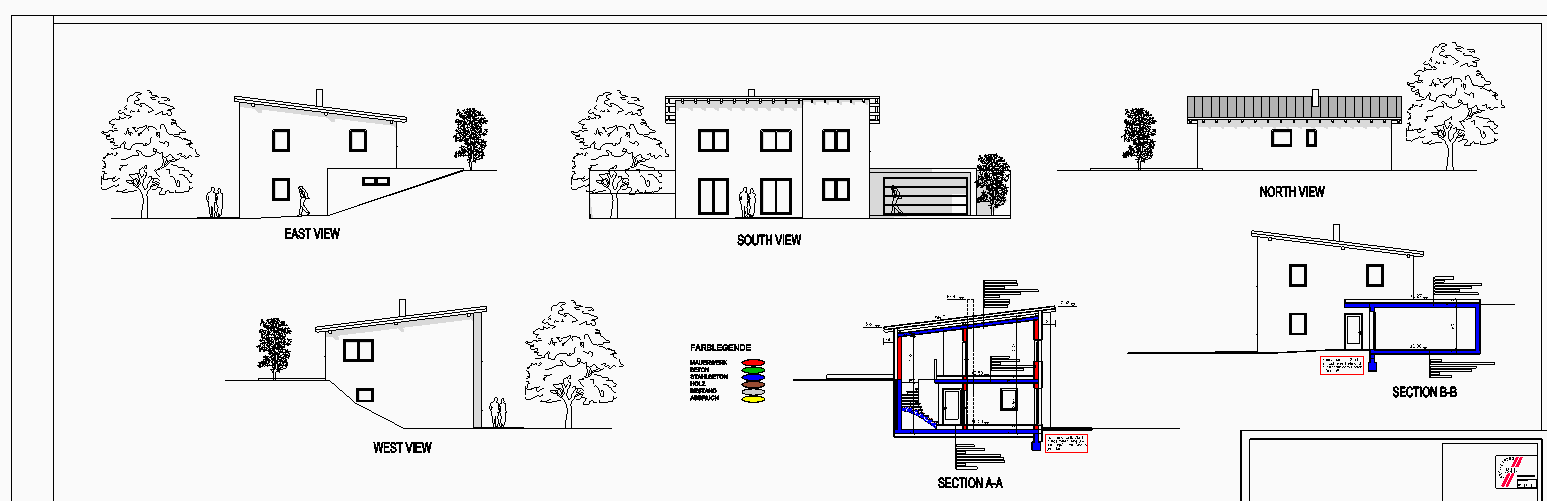
Section and Elevation
The command places two sections across the centre of the model perpendicular to each other (A-A, B-B) and creates the four main elevation views in one step.
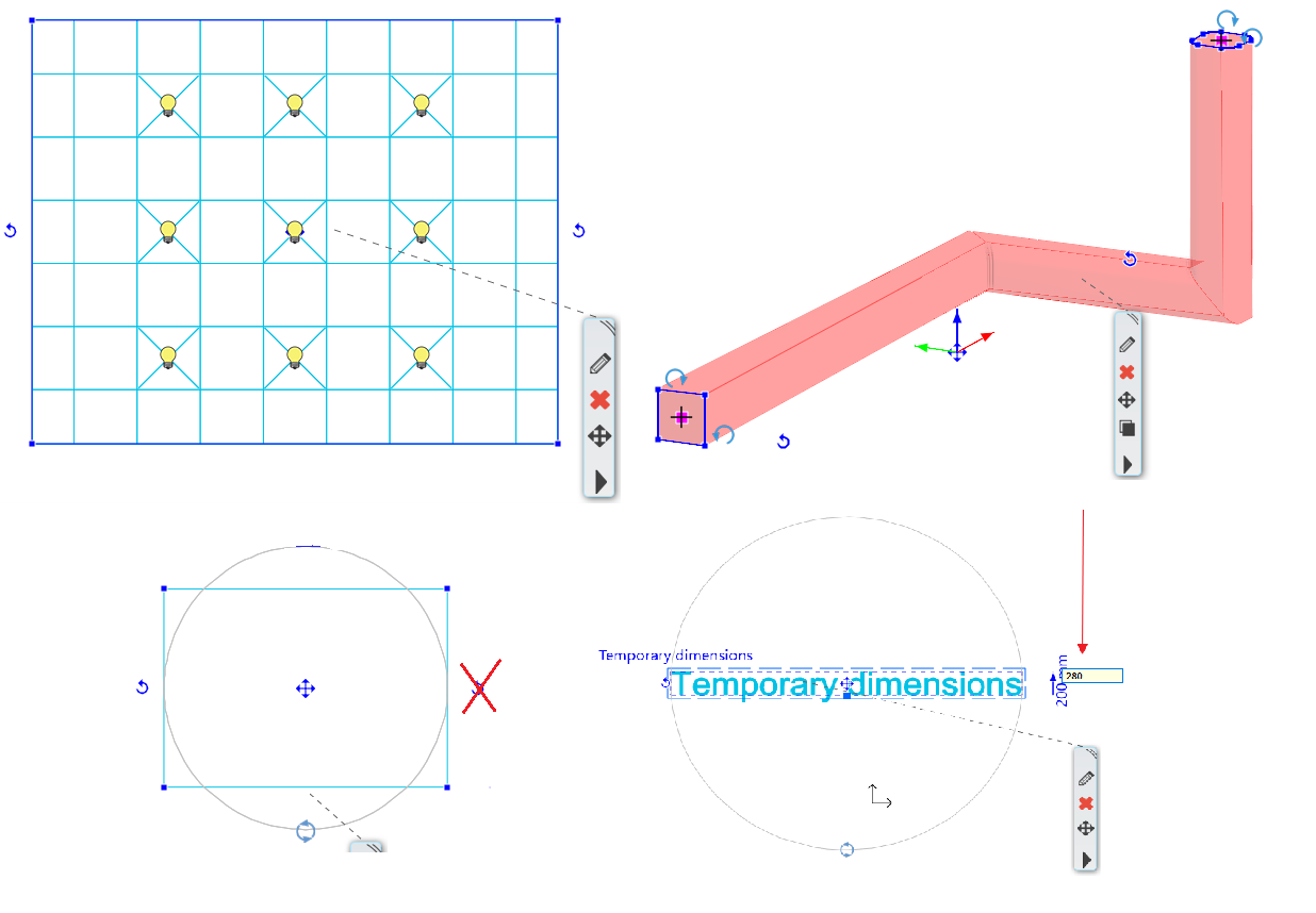
New grip points and editing nodes
New grip points for ceiling: Directly access elements, lamps inserted into the ceiling.
New nodes for the Sweep 3D: Extended grip points help the editing of the selected element in the 3D window.
New rotation grip for 2D elements: Line, polyline, arc, text, 2D group, raster image can be all rotated freely. The rotation icon on the right side disappears, a new node is introduced.
Text height modifier: Selected text height is editable by a temporary dimension.
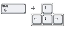
Nudging
Nudging is a very simple way to move your selected elements.
Press the keyboard arrow keys to move the elements horizontally or vertically in a specific distance.
Each press of a keyboard arrow key moves the selected elements with the "normal" or "fine" increments.
Nudge settings: Set up your setting in Option dialog - Snap and Grid panel.
Default increments: Normal -> 100 mm, Fine -> 10mm.
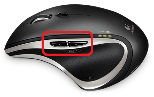
Navigation via mouse buttons
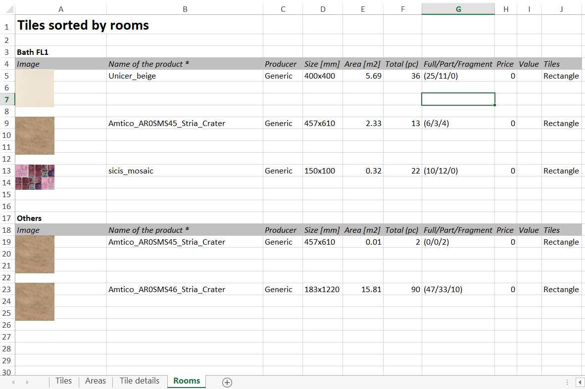
Tiling list sorted by rooms
The Tiling consignation is extended with a new Excel worksheet that lists the tiles sorted by rooms.
Plot Layout: View Titles on Sheets
When you place a document on the Plot Layout, ARCHLine.XP displays its title, such as floor plan and storey, elevation, section, and 3D view name.
The title is Project-specific information and linked to the Project Navigator documents name.
Of course, you can rename the title text. The renaming method changes the name of the document in the Project Navigator and on the Plot Layout altogether.
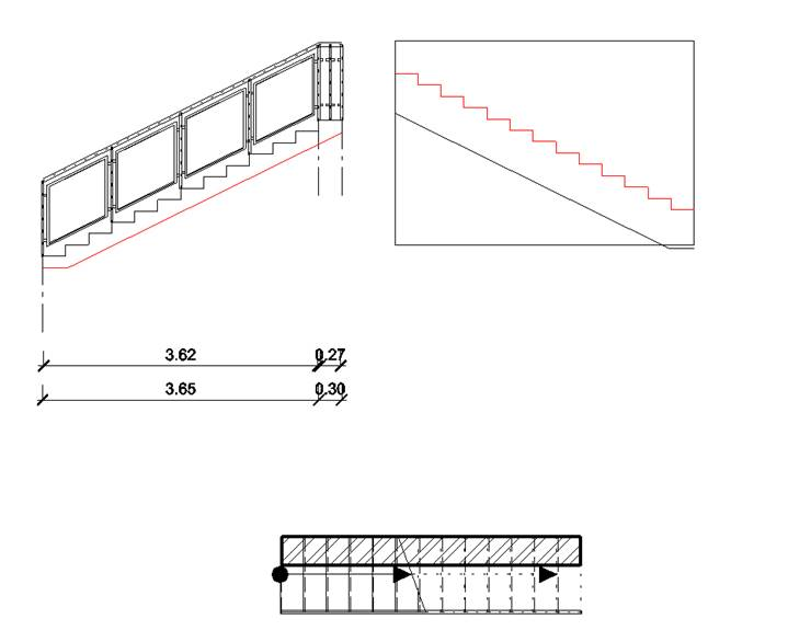
Uniforming a staircase contour appearing in various Edit Layout commands
The lower and upper contours of the stairs are displayed in the editing commands as well. This way you can decide whether the stair wall cut command is to hold the stairs above or below the stairs. Structurally, both situations may be justified.
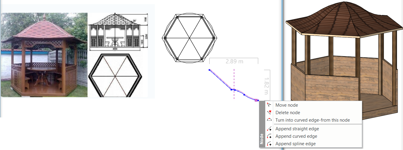
Roof cross section profile editable (for automatic roofs)
When you create a roof with a custom shape, you sketch the profile first and then use that shape on the roof you create.
This profile is available later to be edited with the Edit section profile command.
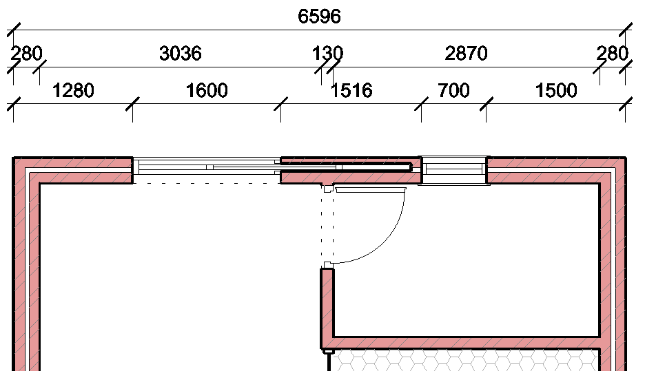
Wall Dimensions
Dimensioning is an area where ArchLine XP excels by generating all dimensions at one time. This includes separate dimension lines for:
- The whole wall, endpoints and connections.
- Measuring the wall to core layer only, wall layers separately, to midpoints.
- External window/door connections.
- Internal wall dimensions.