Case studies
Pop Art Paradise - Family Home in the Magic of Colors
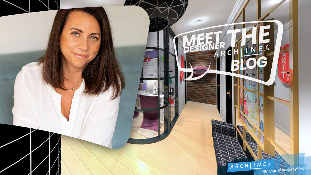
Interior design graduation project by Éva Gáspárné Szebenyi.
A surprising interior where Pop Art style meets the Disney world!
Introduction
My name is Éva Gáspárné Szebényi, I graduated as an interior designer in June 2023. I have been working as a photographer for 20 years. One of the most important things in interior design is to have the right spatial vision and spatial organization, and because of my original profession, I feel that I can use this as an advantage. I learned about ARCHLine.XP during my studies and have been learning ever since. It's great that I can present an accurate picture of my ideas and plans and that everyone can put themselves in the virtual home.


Project description
The house is located in Győrzámoly (Hungary), in one half of a newly built semi-detached house. The two twin houses are separated by spacious parking lots, so each of the two houses has its own living space. My clients, a middle-aged couple with 1 year old twins and their children are moving into the 93,46 m2 apartment. Fortunately, the grandparents live close to the family and can help out a lot with the little ones, so the mother, who is an interior designer, can receive clients at home while the father works in the family-owned grocery shop.
As the family loves bold and spectacular furnishings, we have decided to go for a Pop Art style in the interior design. Here, we made sure to avoid the grandiose and sometimes intimidating objects that are typical of the style, and very bold colours, as there are young children living in the home. That's why the main direction was the world of cartoons, combining an underground feel with a mix of metal, glass and brickwork. I took care to use parquet flooring outside the bathrooms, so that children who were learning to walk would be safe.
The original floor plan shows a bathroom and toilet to the left of the front door. I moved them opposite the entrance to create a comfortable office for the mother to receive her clients. I considered it important to have it right next to the entrance, so that clients don't have to be carried through the apartment, so that the family's living space can remain private. Since the Pop art style is what the interior designer mom feels most comfortable with, I went for a bolder painting and color scheme in this room. The office is housed in a glass "cage", the corner of which is rounded towards the hallway. Partly for a more extravagant look, so that clients can get a sense of the interior designer's style from the moment they arrive. On the other hand, in terms of function, it also makes life easier with the twins, as I rounded the side of the built-in wardrobe opposite, in symmetry with the glass. This makes everyday preparations and dressing the twins - especially during the cold seasons - more comfortable, spacious and usable. The transparency of the glass increases the space, allowing mum to work and plan in peace, while also keeping an eye on the children when there are no clients. And even when clients arrive, the glass can be turned opalescent at the touch of a button, making meetings more intimate. This makes everyday preparations and dressing the twins - especially during the cold seasons - more comfortable, spacious and usable. The transparency of the glass increases the space, allowing mum to work and plan in peace, while also keeping an eye on the children when there are no clients. And even when clients arrive, the glass can be turned opal at the touch of a button, making meetings more intimate.
By keeping the load-bearing walls, I have left the large airy room to the right of the entrance as a common function space, so the living room, dining room and kitchen are located here. The kitchen is separated from the dining room by a glass wall with a metal frame. As the dad is a hobby pastry chef, I felt it was important to create not only a wide large island, the edges of which I rounded to fit the shape of the mum's study and to allow safe access for small children, but also a glass wall that doubles as a wall. In the kitchen, light colours predominate, accentuated by the colourful, cartoon patterned wall tiles.
In the dining room and living room, colourful leather sofas and armchairs have been given a larger role, alongside black and brick walls, bringing the world of subways into the common space. Here too, the presence of small children was a key consideration, and I chose closed cupboards under the TV and in the dining area. A black and white comic book on the opposite wall frames the space and the kitchen-dining room connection.
Leaving the living room, we return to the hallway, where the guest toilet is located on the right. Here I chose dark-coloured tiles so that it can be easily kept clean when used by clients. I placed the boiler in a large, double-fronted cupboard in the room so as not to detract from the overall look. This gas boiler provides the floor and ceiling heating. Here I found space for the washing and drying machines and designed a deep built-in cupboard for the family of four. Clients will also encounter the couple's fun and provocative style here, as, when they look in the mirror, a monkey will look back at them in the form of a picture.
The bathroom next door also features the comic book world in the form of tiles and a brick wall on the opposite wall. Again, the children were the main focus of the design, so I added a spacious bathtub next to the shower. I placed these in an airspace separated by a glass wall from the toilet near the entrance and the two bathroom cabinets with sinks, which are also rounded in shape, like so much else in the apartment.
I put the two bedrooms at the end of the apartment, one for the parents and one for the children. In the parents' bedroom, the colourful pictures and accessories were the main focus. I designed a unique wardrobe set with a corner dressing table and a working corner, the latter for the husband to take care of his administrative tasks arising from the family business.
I left the design of the children's room to the end, even though the basic idea with the cartoons was given to me by this room. I was thinking a lot about how to arrange the 1-year-old twins in an extravagant style, when I remembered the pair of Mickey and Minnie mice, just like children are made up of a boy and a girl pair. And the cartoon world fits the Pop art style, so I came up with this design through the kids. In the nursery, the boy has black and white and the girl has red and white colour scheme for their cribs. Blue and yellow are also used a lot in the story, so I placed those as well. In the false ceiling, I made a cut-out in the shape of a mouse head with an LED strip running through it, so it can help you fall asleep at night.
Éva Gáspárné Szebenyi
Contact information:
Mobile: 06-20-488-2800
website: https://www.szebenyieva.hu/
e-mail: This email address is being protected from spambots. You need JavaScript enabled to view it.